 Ginetta
Ginetta Logo
Meaning, history & PNG download
Last updated October 2025
Ever heard of Ginetta? If not, you're in for a treat! This British gem is all about raw, unadulterated driving fun. They build stripped-down, track-focused machines that are light as a feather and quick as lightning. Forget fancy tech; Ginetta delivers a proper, visceral connection to the road. These aren't your everyday grocery-getters. Ginetta cars are built for pure exhilaration, for those who crave the thrill of a high-performance, precision-engineered sports car. It's about passion, agility, and a driving experience that truly puts a smile on your face.
Free · transparent PNG · no signup required
Model guide in progress
Verified model information will appear here as it is reviewed.
No logo evolution data available yet
View Full Logo Archive →About the Ginetta Logo
Ginetta was established in 1958 in Woodbridge, Suffolk, by the four Walklett brothers - Bob, Ivor, Trevers and Douglas - who built lightweight sports and racing cars, with the firm later relocating to Yorkshire under new ownership.
01Ginetta Logo Meaning & Symbolism
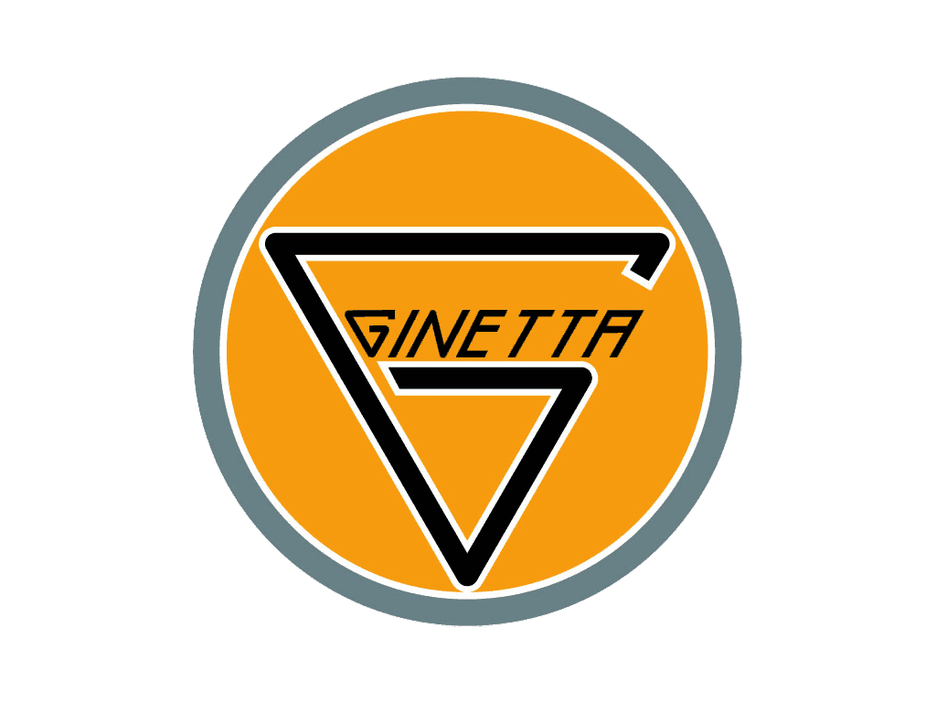
The Ginetta identity is a wordmark rather than a pictorial emblem, with a distinctive stylised 'G' and modern lettering meant to evoke speed and the firm's motorsport focus.
#EE7F13
Primary
#000000
Secondary
03Download Ginetta Logo
You can download the official Ginetta logo in high resolution using the button below. The Ginetta emblem is available for editorial and reference purposes.