 Audi
AudiAudi Logo
Meaning, history & PNG download
Last updated March 2026
Audi is a German luxury car brand with roots stretching back to 1909, when August Horch founded the company in Zwickau, Germany — the name 'Audi' being the Latin translation of his surname ('horch' means 'hark' or 'listen' in German). The iconic Audi logo — four interlocking rings — represents the 1932 merger of four automakers: Audi, DKW, Horch, and Wanderer into Auto Union AG. Today, that symbol is one of the most recognized car logos in the world, embodying a legacy of engineering precision and innovation. Headquartered in Ingolstadt, Germany, Audi has evolved into a global powerhouse under the Volkswagen Group umbrella. The Audi car brand is celebrated for blending performance with sophistication. Models like the Audi A4 — the brand's best-selling sedan globally — and the Audi A6 executive saloon have defined the benchmark for premium mid-size and full-size vehicles for decades. Audi's Quattro all-wheel-drive system, introduced in 1980, revolutionized rally racing and road car dynamics alike, earning 23 World Rally Championship victories between 1981 and 1984.
Free · transparent PNG · no signup required
Model guide
Explore Audi models
Browse the most notable Audi vehicles and open a model guide for more detail.
Showing 8 of 9
 Photo coming soon
Audi e-tron GT
The Audi e-tron GT is a low-slung electric grand tourer whose series production began in late 2020 ahead of its 2021 world premiere and market launch.
Photo coming soonAudi Q3
The Audi Q3 is the compact member of Audi's Q-family, launched in 2011 and developed across three generations.
Photo coming soonAudi Q5
The Audi Q5 is the brand's mid-size SUV line, first launched in 2008 and renewed through three generations.
Photo coming soonAudi R8
The Audi R8 was the brand's two-generation mid-engine road car, produced from 2006 until the final example left Böllinger Höfe in March 2024.
Photo coming soonAudi Q7
The Audi Q7 introduced the brand's full-size SUV line in 2005, combining Q-family design with up to seven-seat versatility.
Photo coming soonAudi RS6 Avant
The Audi RS6 is the high-performance A6-family line introduced in 2002; the Avant pairs that role with an estate-car body and everyday utility.
Photo coming soonAudi TT
The Audi TT translated a 1995 concept into a distinctive production coupe in 1998 and remained in production across three generations until 2023.
Photo coming soonAudi A6
The Audi A6 is the executive model line whose C-series ancestry begins with the Audi 100 of 1968 and has carried the A6 name since 1994.
Logo Evolution Timeline
Explore 9 logos from Audi's history

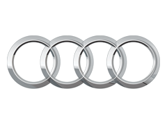
2016Current
Following the Volkswagen Group's diesel emissions scandal (Dieselgate) that erupted in September 2015 and directly implicated Audi engines, the brand pursued visual simplification to shift consumer perception. The flattened logo also supported digital UI requirements across Audi's expanding MMI infotainment touchscreen interfaces and app ecosystems.
Design Notes
The four rings were flattened into a two-dimensional outline style, eliminating the chrome three-dimensional gradient treatment, rendered in solid silver-grey or white against dark backgrounds, with the 'AUDI' wordmark refined for pixel-accurate digital screen rendering.
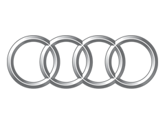
2009
Audi celebrated its centenary in 2009, marking 100 years since August Horch founded the original company in Zwickau. The anniversary logo refresh coincided with the global debut of the Audi e-tron concept at the Frankfurt Motor Show, signaling the brand's entry into electric vehicle development as a core future strategy.
Design Notes
The four rings received a more sculpted, deeply three-dimensional chrome rendering with enhanced specular highlights and shadow gradients, conveying premium craftsmanship, while the 'AUDI' wordmark was sharpened in a custom geometric sans-serif typeface.
1995
Audi underwent significant corporate restructuring within the Volkswagen Group during the early 1990s and appointed Herbert Demel and later Franz-Josef Paefgen to senior roles driving product premiumization. The 1995 logo update aligned with the launch of the Audi A4 and A6, which replaced the old 80 and 100 series and introduced the modern alphanumeric naming strategy.
Design Notes
The four rings transitioned to a flat, high-contrast black-and-white graphic treatment for print applications, while retaining a chrome three-dimensional version for vehicles, with 'AUDI' set in a proprietary clean sans-serif typeface replacing earlier generic fonts.

1978
Audi launched the turbocharged Audi 5000 in North America and was gaining significant traction as a premium competitor to Mercedes-Benz and BMW. The updated logo coincided with Audi's aggressive international market push under Volkswagen Group direction, requiring a more confident, upscale visual identity to compete in luxury segments.
Design Notes
The four rings were rendered with increased visual weight and a more polished chrome finish, accompanied by a refined bold sans-serif 'AUDI' logotype, signaling the brand's positioning as a genuine luxury competitor rather than merely a volume automaker.

1969
Volkswagen Group had acquired Auto Union in 1965 and subsequently merged it with NSU Motorenwerke AG in 1969, creating Audi NSU Auto Union AG. This corporate restructuring prompted the reintroduction of the 'Audi' name as the primary brand, replacing 'Auto Union,' and the four rings were formally reassigned to carry the Audi identity specifically.
Design Notes
The four interlocking rings were rebranded under the 'Audi' name, with clean sans-serif 'AUDI' lettering introduced alongside the rings, dropping the 'Auto Union' text in favor of a modern typographic presentation in black and silver.

1949
After World War II, Auto Union's Chemnitz facilities fell inside East Germany and were seized by Soviet authorities. Former Auto Union employees reestablished the company in Ingolstadt, West Germany, in 1949. The four rings were retained to assert continuity with the pre-war legacy, though the 'Auto Union' name now accompanied the badge.
Design Notes
The four interlocking rings continued as the primary symbol, now presented in a simplified postwar graphic style with 'AUTO UNION' text beneath, produced without pre-war ornamental detailing due to the stripped-down economic conditions of reconstruction.

1932
Four struggling German automakers — Audi, DKW, Horch, and Wanderer — merged under Saxon State Bank pressure into Auto Union AG, headquartered in Chemnitz. The four interlocking rings were created specifically to represent this merger, with each ring symbolizing one of the four founding companies united under a single corporation.
Design Notes
Four equal interlocking chrome rings arranged horizontally debuted, each ring representing one constituent brand; the design was paired with 'AUTO UNION' lettering and rendered in polished silver metallic tones.
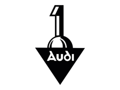
1910
One year after founding, Audi formalized its corporate identity as production of its first automobile, the Audi Type A, began in earnest. The revised emblem accompanied the company's first official sales catalog and public motor show appearances, establishing a more permanent typographic identity for the young automaker.
Design Notes
The 1910 mark refined the wordmark with a cleaner serif font presentation, typically enclosed in a circular or oval border, printed in black ink consistent with period letterpress manufacturing documentation.

1909
August Horch founded Audi Automobilwerke GmbH in Zwickau, Germany, after being forced out of the company he previously founded, Horch. Unable to use his own surname legally, he translated 'Horch' (German for 'listen') into Latin, creating 'Audi.' The original emblem reflected this academic, classical branding approach.
Design Notes
The early emblem featured the 'AUDI' wordmark in serif lettering within an ornate oval cartouche, rendered in dark tones with decorative flourishes typical of Wilhelmine-era German industrial branding.
About the Audi Logo
After leaving his earlier firm Horch, August Horch started this company in 1909 and adopted the name 'Audi' — the Latin equivalent of his surname, since 'horch' means 'listen' in German and 'audi' is its Latin counterpart.
01Audi Logo Meaning & Symbolism
Four interlocking rings representing the 1932 merger of four manufacturers (Audi, DKW, Horch, and Wanderer) that formed Auto Union. Each ring stands for one of the founding companies.
#F50537
Primary
#000000
Secondary
02Audi Logo Evolution
This archive contains 9 versions of the Audi logo, with the current design introduced in 2016. Some versions may have overlapped across vehicles, corporate communication and regional applications.
03Download Audi Logo
You can download the official Audi logo in high resolution using the button below. The Audi emblem is available for editorial and reference purposes.